Color palette
Navy#213458
Teal#397D89
Slate#5A6A7A
White#FEFFFF
Orange#E9953E
Pale gray#D9DEE2

Brand Identity Design
A visual foundation for a biotech advisory business helping emerging companies build their quality infrastructure.
The challenge
Blueprint Biotech Advisory supports biotechnology businesses with quality assurance, quality control, and validation expertise. As a new business, it needed an identity that conveyed professionalism, trust, and consistency while reflecting the structured thinking behind its name.
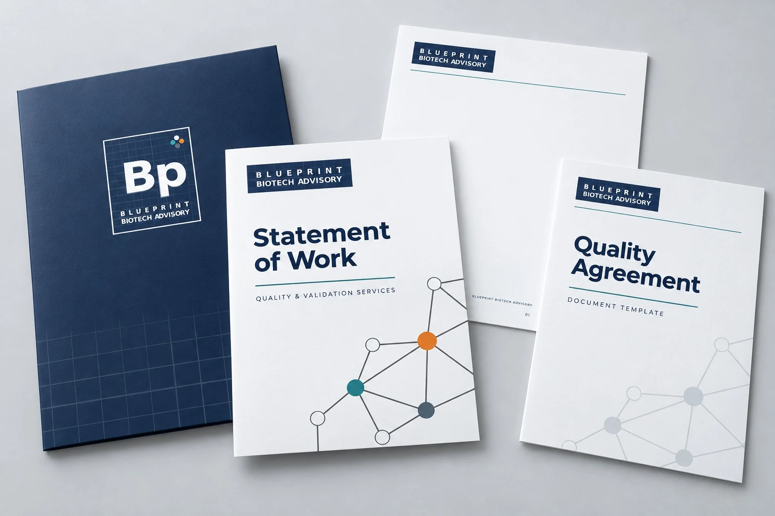
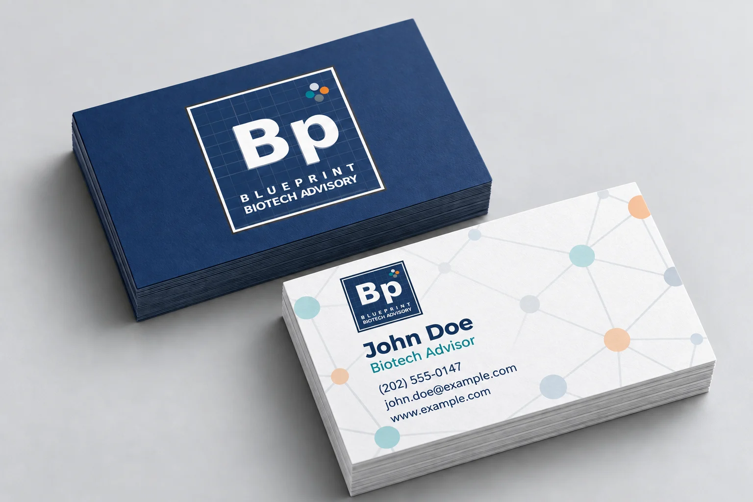
The immediate priority was practical: a brand that could carry across client documents, agreements, and business cards, with room to extend into a website and social media.
Creative exploration
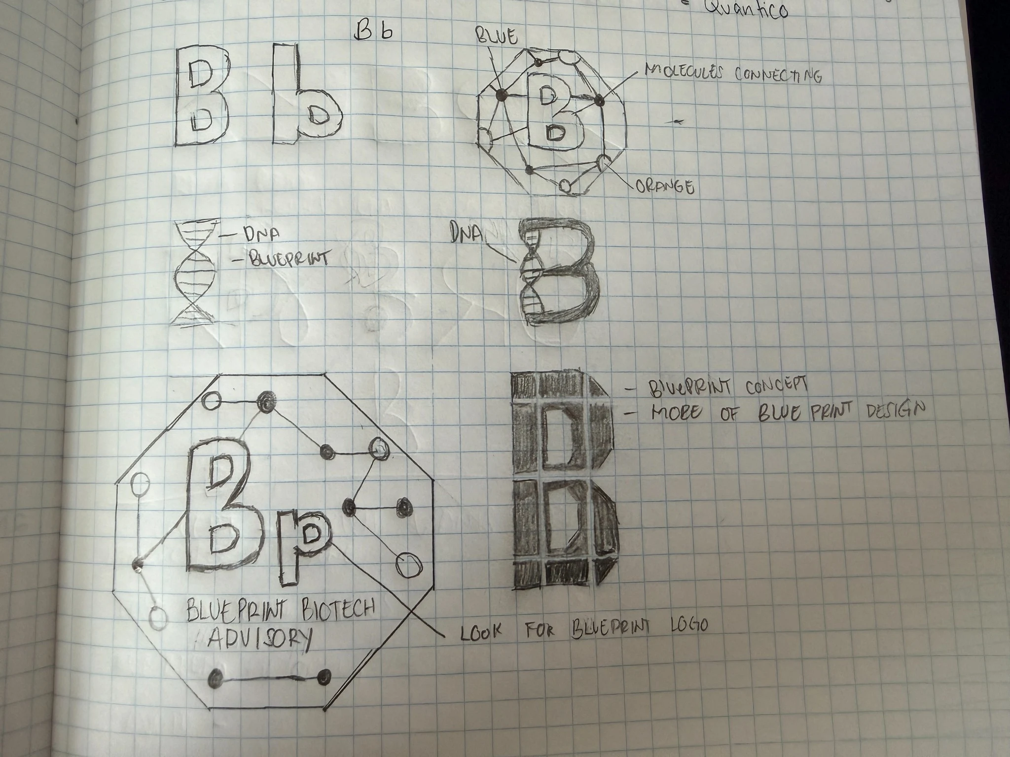
Early sketches explored letterforms, DNA, molecular connections, and blueprint structures. These explorations led toward a direction that paired a recognizable scientific reference with the client’s preference for clean lines, blue backgrounds, and sharp white details.
The client responded positively to the periodic table inspired monogram, seeing it as a distinctive connection to the biotechnology industry.
Final logo system
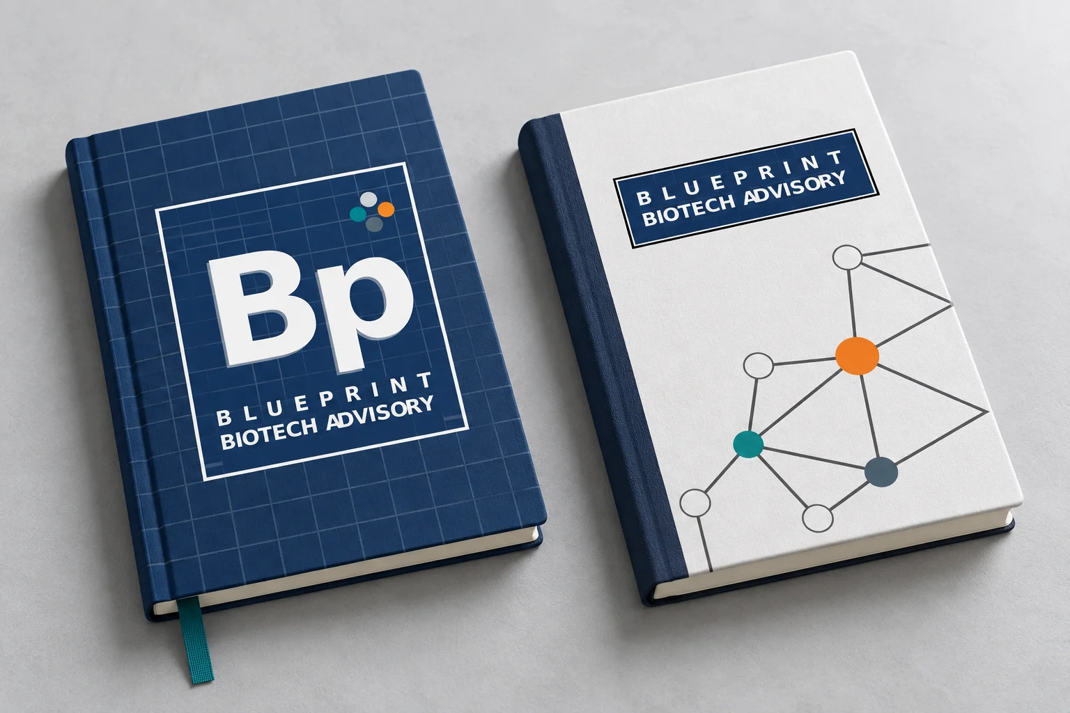
The “Bp” monogram draws inspiration from a periodic table tile, while the blueprint grid reflects structure and planning. A cluster of four colored circles adds a subtle molecular reference, suggesting connection and collaboration while bringing a distinctive accent to the identity.
A horizontal secondary logo provides another format for applying the identity across different layouts.
Brand system
Montserrat and Roboto support the typography system, while the blue foundation, supporting colors, blueprint grid, and connected network graphic provide a consistent structure for branded materials.
ABCDEFGHIJKLMNOPQRSTUVWXYZ
abcdefghijklmnopqrstuvwxyz
0123456789
ABCDEFGHIJKLMNOPQRSTUVWXYZ
abcdefghijklmnopqrstuvwxyz
0123456789
A structural reference that reinforces the name and gives layouts a recognizable foundation.

A supporting graphic that evokes molecular connections and collaboration without assigning a scientific meaning to each individual color.
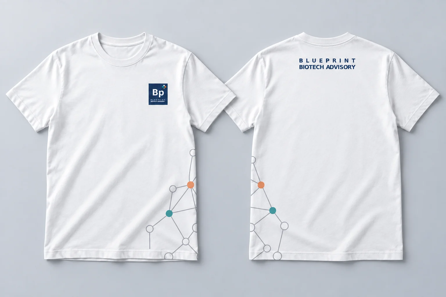
Brand application concepts
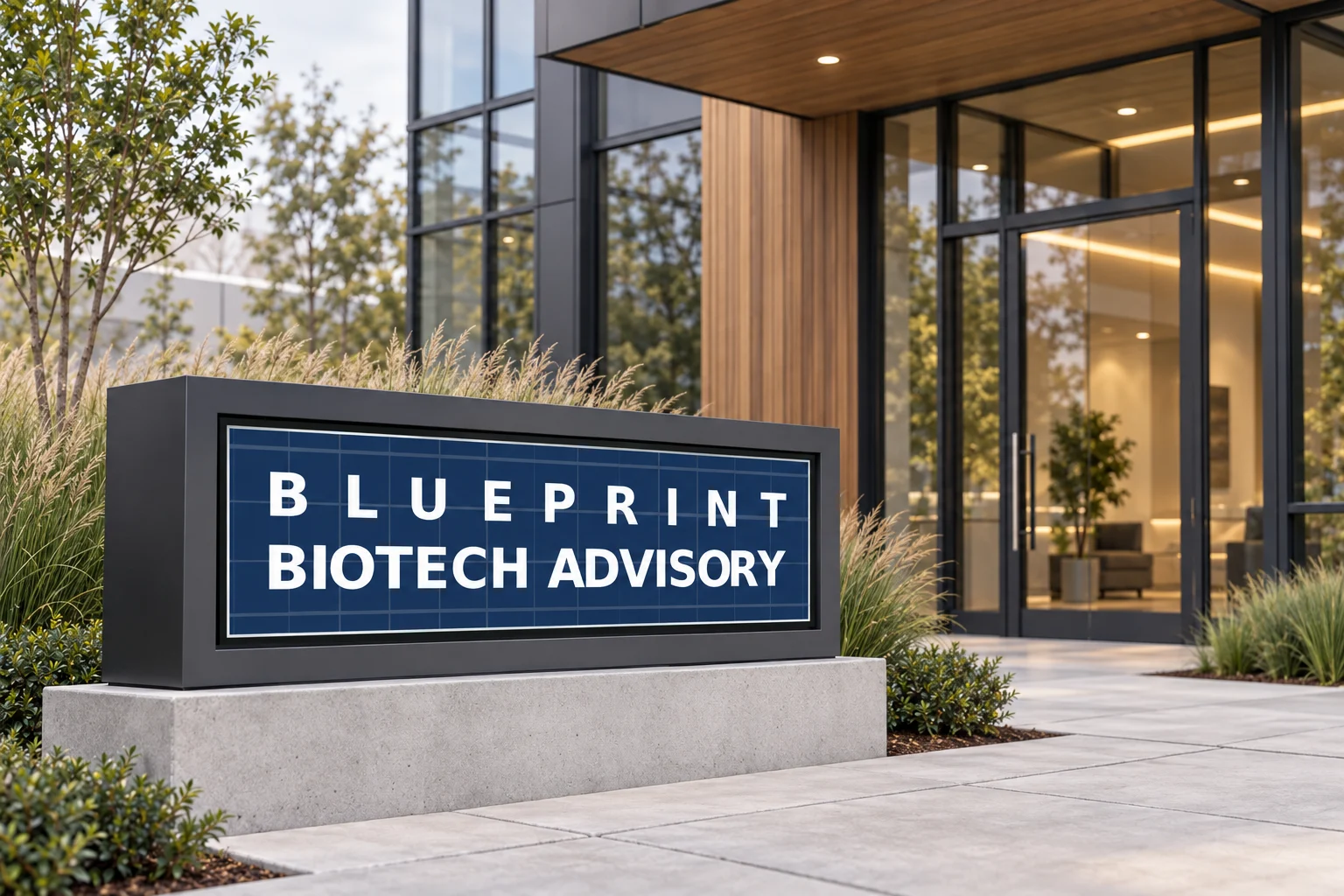
These concepts demonstrate how the identity can extend across practical business materials and environmental applications. They are visual demonstrations and were not presented as physically produced items.
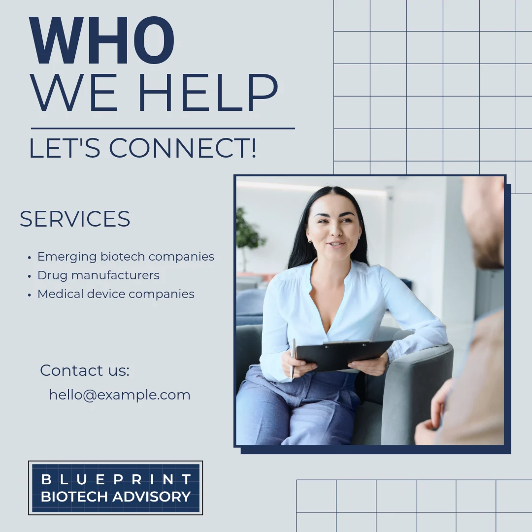
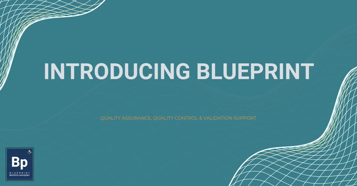
LinkedIn templates
Two flexible templates were created to introduce the business, explain its services, and support a consistent presence on LinkedIn.
Environmental application
The completed identity
The project brings together primary and secondary logos, a defined color palette, typography, a supporting graphic asset, a brand style sheet, and two LinkedIn templates.